Responsive Design
Responsive design is a fairly new technology that allows a website to automatically adapt to different screen sizes. This means that if you view the same website from different devices (ie… iPad, desktop PC or smartphone) you will see a layout customized specifically for the size of that particular device.
In other words, your website will provide the very best user experience customized to the exact device the visitor is viewing your website from. No need to build separate websites for different devices, one website for all devices.
More Internet Traffic Now Originates From Tablets Versus Smartphones!
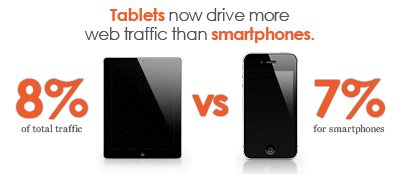 Yes, it’s true. According to a study conducted by Adobe, people visiting your website from a mobile device are now more than likely doing so from a tablet rather than a smartphone! Think about that, more internet traffic originates from tablets than smartphones across the internet.
As impressive of a statistic as that is, think about how many more smartphones there are versus the number of tablets? There’s significantly more smartphones out there than iPads (or other tablets) so the fact that more internet traffic originates from these greatly outnumbered tablets is truly amazing.
Over time as the number of tablets continues to grow, the volume of mobile traffic will increasingly continue to come from tablets. Optimizing your website for tablets simply cannot be ignored.
You have two options for optimizing your website for tablet users — make a separate site for each device or simply use responsive design. This means that if you currently only have a mobile website, you’re completely ignoring tablets! Contact us to find out how to go responsive.
The 1980’s Called… and They Want Those Mobile Websites Back!
The old way of accounting for mobile traffic by simply building a “mobile website” is quickly becoming a thing of the past. The numerous technical flaws that these mobile sites contain can actually cause more harm than good, not to mention ignoring tablets and the people visiting your website from them is certainly a losing proposition.
Responsive design has made its mark on today’s technology by elegantly bringing together multi-device web browsing into just 1 website. And please don’t take our word for it, take Google’s as responsive design is now their official recommendation.
Google Officially Recommends Building Websites With Responsive Design
Google has officially recommended optimizing your website with responsive design. There’s many reasons why Google has decided responsive is superior to a mobile website, and here’s a few of them:
- Single URL. Allows Google’s algorithms to assign the indexing properties for the content.
- No redirection. Mobile website’s that use a redirection script are slow to load and generally error prone. This is not a factor when you go responsive.
- Saves resources. You only have to build 1 website to account for all devices and Google only has to crawl your pages once. This can help get more of your website indexed and also help keep it fresh by allowing Google to complete crawls quicker and more frequently.
Is your website built according to Google’s official recommendation? If not, it’s time to go responsive – contact us to find out how.
Responsive Websites Built by ABM
Aesthetic Brand Marketing also recommends responsive design and all new websites are built with this technology included. If you don’t want to rebuild your website from scratch we can work with your existing site to optimize it properly for all devices.
Please get in touch to learn more about what responsive design can do for you.

